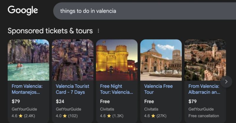

Imagine walking past a restaurant with an enticing menu, only to find every item listed alphabetically. No categories, no sections, just a long list where “Apple Pie” sits above “Beef Rendang” and “Coca Cola.” Without structure, it’s hard to make sense of the menu, and most diners would move on in search of one that’s easier to understand.
Too many multi-day tour operators present their tours in exactly this way. An “Upcoming Tours” page lists departures in chronological order, or an “Our Tours” page arranges them alphabetically. For first-time visitors, this can feel overwhelming, causing them to abandon the site and turn to competitors who present their tour catalogs more clearly.
So what’s the best way to organize a tour catalog to attract, engage, and convert travelers?
To answer this, I studied 10 of the world’s leading multi-day tour operators, including Intrepid, G Adventures and Abercrombie & Kent. I analyzed more than 5,000 tours across 100 categories to understand how they design and structure their catalogs. From this research, I uncovered five principles you can apply to your own multi-day tour catalog today.
Here are the principles I discovered:
- Organize tours by destination and travel style – Use clear, easy-to-understand subcategories that help travelers grasp your range quickly.
- Give every category a landing page – Inspire, educate, and guide travelers toward a shortlist of tours.
- Invite endless exploration – Offer natural next steps that keep visitors browsing deeper into your range.
- Offer filters for deeper discovery – Provide tools that let travelers refine tours by what matters most to their preferences.
- Guide travelers towards a decision – Use decision aids, like quizzes or comparison tools, to simplify choices and remove friction.
Organize tours by destination and travel style
A tour catalog is structured around two headline categories: Destinations and Travel Styles.
A Travel Style (often called “Ways to Travel”) is a simple, easy-to-understand label that captures the type of experience a tour offers. It organizes the catalog into distinct groups such as Hiking & Trekking, Under 30s, or Longer Stays. This helps travelers browse the range intuitively and quickly spot the styles best suited to them.
Travel Styles are versatile: they can describe what you do on tour (e.g., Snowboarding), who the tour is for (e.g., Families), or what you might see (e.g., Safari). In practice, almost anything can be framed as a style but what matters is that the labels are clear, familiar to travelers, and resonate with your audience. Below is a table showing the five ways to describe a style, with examples drawn from the operators I studied.
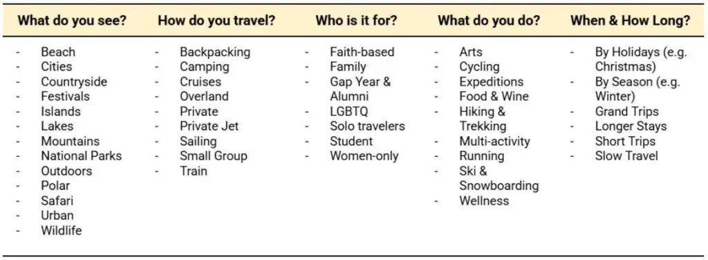
A few operators add a third category focused on who the tour is for, rather than grouping this under a Travel Style. Backroads, for example, organizes its catalog into Destinations, Activities, and Travelers. Under Travelers, they highlight Women’s Adventures, 30s & 40s, and Trips for Families. This reflects that Backroads designs trips around specific traveler types, and giving these groups top-level visibility helps travelers quickly identify with the catalog.
When selecting Travel Styles for your own business, keep the range small. Across the operators I studied, most presented 5–10 styles—a range that aligns with Miller’s Law, which suggests people can comfortably hold about 7±2 items in memory at once. Use clear, familiar labels so travelers can quickly see what fits and start exploring. Clarity wins over creativity: “Hiking” is easier to grasp than “Undiscovered.”
Your Travel Style categories should make it simple to answer: “What types of tours do you offer?” Choose styles your ideal traveler will recognize instantly, and together they should reflect the breadth of your range.
Give every subcategory a landing page
Once travelers decide on a Destination or Travel Style, many of the operators I studied direct them to a dedicated landing page for that subcategory, rather than straight to a list of tours. These pages inspire, explain the subcategory, and nudge travelers from casual browsing into active consideration, steering them toward a clear shortlist of tours.
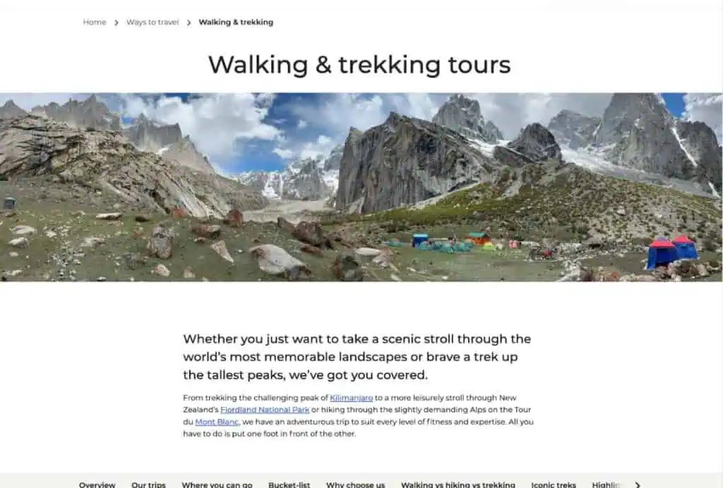
Like any effective landing page, a well-structured page guides travelers through the essentials they need to decide if the product is right for them. For tours, that means starting by describing what the category is and who it’s for, then showcasing related destinations and featured trips. Below is the structure I observed across operators’ style pages:
| Section | Purpose | What to include |
| Hero | The first impression of the page, setting context and capturing attention right away. | Clear headline for the category, inspiring image, one-line value prop and primary Call to Action (e.g., “View trips”). |
| Who it’s for | Frames the experience and explains who the category is designed for. | 2–3 sentences on the experience, who it suits, and why |
| Featured trips | Gives travelers a curated list of tours, reducing choice overload. | 3–6 best sellers or editor’s picks that showcase the subcategory |
| Destinations in this category | Shows where the experience can take place and links to related destination pages. | Region or country tiles (e.g., Europe, Asia) or key cities/areas; link through to destination pages. |
| Highlights | Sparks desire by showcasing iconic or must-do experiences within the subcategory | Bucket-list treks/experiences, top things to do/see for the style or destination. |
| Why choose us | Builds trust by showing why the operator is credible for this style or destination. | 3–5 reasons/differentiators (local leaders, responsible travel, inclusions, service), plus badges/awards. |
| FAQs | Short answers to common questions | 5–7 common questions (timing, inclusions, who it suits, how to book), concise answers. |
| Reviews & Ratings | Reassures travelers with social proof from other guests. | Star ratings, recent quotes, links to full reviews for the theme/destination. |
| Related content | Keeps travelers exploring by pointing them to helpful resources. | Editorial links (guides, stories) connected to the category (e.g., food lists, itinerary ideas). |
Relevant content is what brings a category landing page to life, making it feel tailored to the audience it serves. For example, Intrepid’s Food Tours page showcases must-try dishes from around the world, while its Walking & Trekking page highlights bucket-list hikes. Similarly, G Adventures’ Local Living Tours feature “5 Reasons to Live Locally,” framing the value of that style in a compelling way. These kinds of touches—whether practical guides, inspirational lists, or simple reasons to choose a style—help visitors get inspired with trip ideas and spark interest in experiences they may not have considered before.
Invite endless exploration
Travelers spend an average of five hours engaging with travel content in the 45 days before booking—much of it spent exploring and evaluating (Expedia Path to Purchase study). Discovery is one of the joys of planning travel, and the best catalogs are designed to nurture it. Woven throughout their landing pages are prompts to keep travelers exploring—whether that’s related travel styles, nearby destinations, or suggested tours—that provide natural paths deeper into the catalog. This keeps travelers engaged longer, fuels their curiosity, and makes it far more likely they’ll find—and book—a tour that suits them.
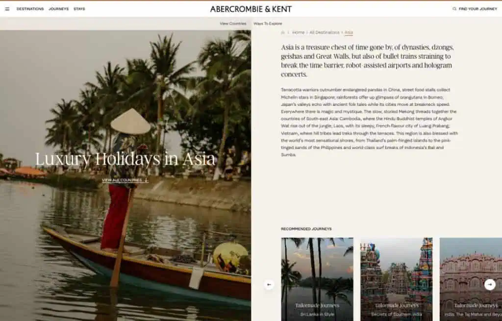
Case study: Exploring Abercrombie & Kent’s Journeys
Abercrombie & Kent’s catalog is a strong example of how to design for continuous discovery. From the home page, visitors can compare destinations side by side, making it easy to scan regions at a glance. Choosing Asia, for instance, leads to a landing page with a short introduction that sets expectations and highlights recommended journeys.
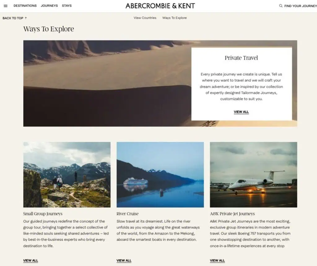
At the bottom of the page, a Ways to Explore section encourages visitors to think about how they want to travel, not just where. Selecting Small Group Journeys opens a style page that explains the experience—guided travel, included transfers, and a social group without the big bus feel.
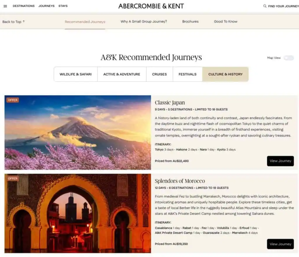
Within that page, sub-styles refine the choice further. Someone interested in a slower pace and cultural highlights can select Culture & History, which leads to a curated list of trips.
Even at the trip level, exploration doesn’t stop. At the bottom of the Japan itinerary, two dropdowns—More Asia Adventures and More Culture & History—suggest related options.
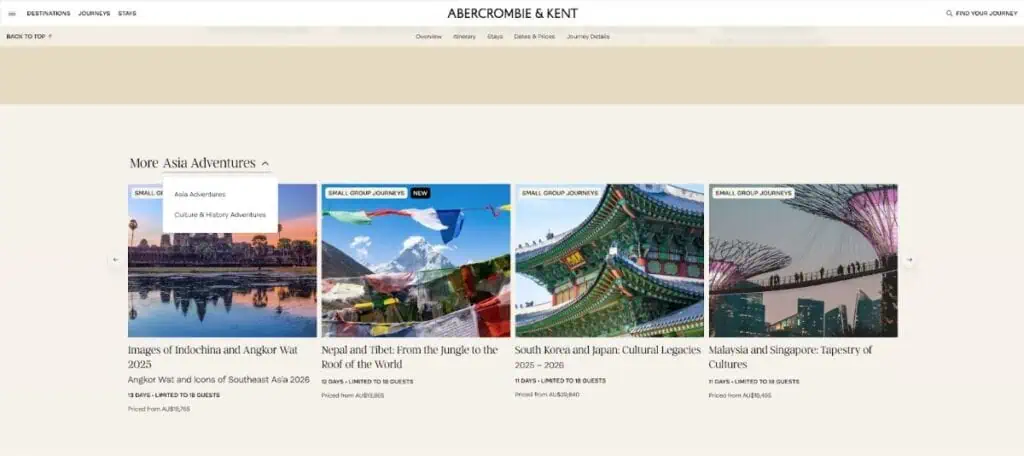
At every step, Abercrombie & Kent provides a suggestion for where to explore next. Visitors never hit a dead end, and the site continually reveals more of the range in a way that feels intuitive.
By offering a natural next step at every stage, a catalog guides travelers on a journey of discovery that gradually reveals the full product range. Here are practical ways operators build those steps into their catalogs:
- Within a destination page: Introduce two or three Travel Styles with a line like “Prefer to hike, sail, or take it slow? Explore by style.”
- Within a travel style page: Lead into top destinations with copy such as “Where this style shines” and add one adjacent style with “Other ways to travel you might enjoy.”
- Within a tour page: Use cues like “You may also like” on trip cards (e.g., Similar length, Similar theme) and dropdowns such as More by Destination or More by Style to keep visitors exploring.
Offer filters for deeper discovery
Once travelers understand your catalog, many will want a single place to view all tours and quickly narrow the list to what aligns with their preferences. A searchable, filterable All Trips page provides that index.
Travelers expect the standard filters—Destination, Style, Date, and Price—but the operators I studied go further. They add granular filters that reflect their unique product and audience, allowing travelers to refine results around personal preferences. For example, Contiki offers filters for Interests, Activity Rating, Primary Transport, and Accommodation Type (and interestingly offering an option for “staying put” under transport!). This level of filtering makes it easy for travelers to find trips that align with their individual preferences.
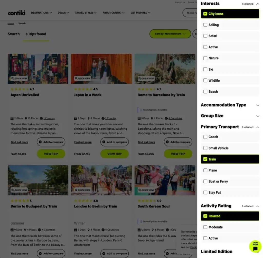
When designing your catalog, focus on the filters that will make the biggest difference in helping travelers decide if a trip is right for them. Add one or two that align closely with your audience. For example, adventure brands might highlight pace or activity level, while culture-focused brands could emphasize interests or accommodation type.
To help you define yours, here are a list of common filters I observed across the operators I studied:
- Destination
- Dates
- Duration
- Price
- Travel Styleexamples drawn from the operators I studied.
- Activity Level
- Age Range
- Transport Mode
- Language
- Trip Features
Guide travelers towards a decision
Even with an organized catalog, travelers still face tough choices—such as deciding between two appealing styles or comparing a dozen trips in the same destination. Too much choice can be overwhelming, and it can prevent travelers from ever reaching a decision.
The operators I studied use a variety of strategies to guide travelers through these decision points, from quizzes to wishlists to comparison tools.
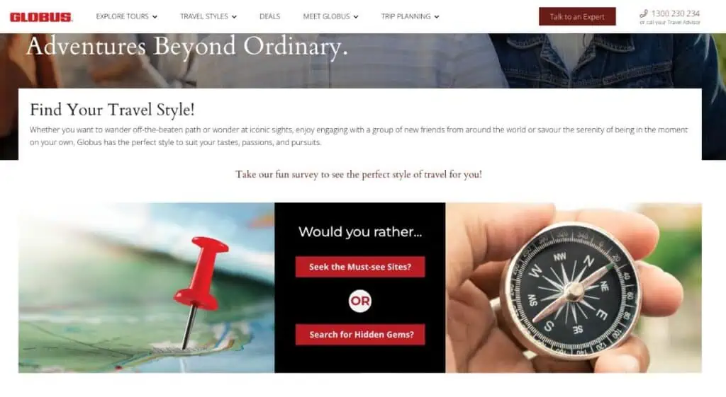
Quizzes
To help travelers choose the styles that suit them, Globus offers a tool called “Find Your Travel Style!” It asks simple questions—such as whether you’d rather see the must-see sites or seek out hidden gems—and then points to a single style that suits them.
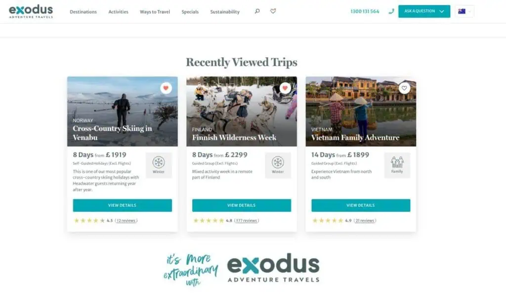
Wish lists
Exodus Adventure Travels allows travelers to create a wishlist by “hearting” trips, and also shows recently viewed options. Both features make it easier for travelers to keep track of tours they’re considering.
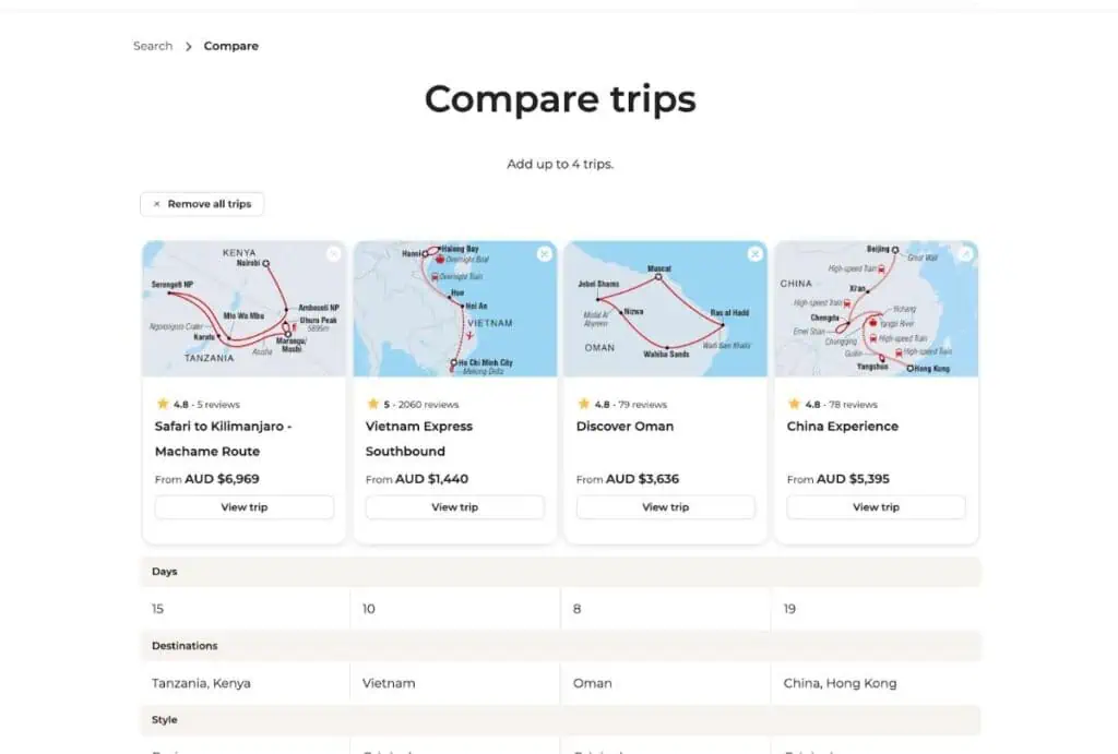
Comparison tools
Intrepid lets visitors compare multiple trips side by side. Being able to view itineraries, inclusions, and pace in one place reduces frustration and helps travelers move forward with confidence.
The underlying principle is to anticipate the moments when travelers are most likely to get stuck—whether that’s choosing a style, comparing similar trips, or narrowing down a long list—and provide tools or signals that support them in those moments. By making decision points easier to navigate, you reduce friction, keep travelers engaged, and increase the likelihood they’ll move forward toward booking.
Designing tour catalogs that convert
Like a well-structured restaurant menu, a tour catalog should make it easy for travelers to find what they’re looking for while also sparking their curiosity to explore further. The operators I studied show that when tours are organized into clear categories, supported by landing pages, exploration paths, granular filters, and decision aids, travelers stay engaged and move naturally toward booking. By applying these lessons from the world’s leading tour operators, you can design a catalog that not only inspires but also keeps travelers engaged and ultimately leads more of them to book your tours.
For a deeper look at the full research analysis behind this article, see Jeff Kwok’s full tour catalog research, including breakdowns of operator categories, styles, and filters.
About the Author

Jeff Kwok is the co-founder of Fieldbook, a leading multi-day tour management platform that streamlines itinerary planning, supplier management, and creating professional tour documents. In his monthly blog Fieldnotes, he shares insights on tour design, tour operations, and industry best practices, drawing on his experience from supporting thousands of tours worldwide. Connect with Jeff on LinkedIn or explore his tour industry insights.
Learn More about Multi-Day Tours & Distribution at Arival
Multi-day tours are among the most complex — and most rewarding — segments in travel. But growth is often blocked by fragmented systems, outdated tech, and limited distribution options. Arival has already helped transform the once-disconnected day tour and activity space into a more connected, scalable, and tech-enabled industry. Now, we’re bringing that same focus to the multi-day tour sector.
The dedicated Multi-Day Track at Arival 360 | Washington, DC on 30 Sept -3 Oct, 2025 brings together the people, platforms, and insights to help you cut through that complexity — so you can grow smarter, scale faster, and deliver unforgettable guest experiences. Learn more about multi-day distribution and working with OTAs, hear from leading companies, and attend hands-on workshops on operators, marketing and technology designed specifically for multi-day tour operators.
The Multi-Day Track is included in your Arival 360 | Washington, DC ticket: learn more and register here.
Become an Insider Pro Access member today and get access to the full library of Arival research, plus many other benefits such as free consulting sessions, special discounts and 20% off in-person events, starting from $179 per year.
Header photo: AI Generated in Canva